
Hardware Solutions
Applications
 Part of the Oxford Instruments Group
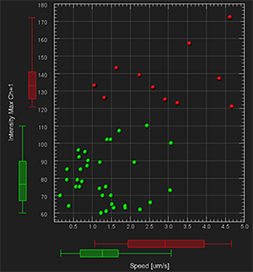
Box plots in ImarisVantage
This tutorial describes box plots within ImarisVantage. It will show you how to interpret box plot information and how the box plots are able to help you discover more about your data. A box plot is a useful tool offering several benefits in the analysis of a large group of numerical data. It summarizes the data of the selected statistical variable to five numbers: the minimum, lower quartile (Q1), median, upper quartile (Q3), and maximum.
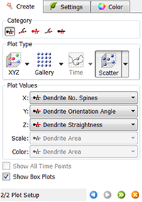
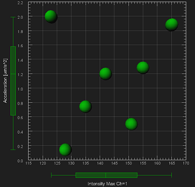
In the second step of the Vantage plot creation wizard, the statistical variables are assigned to the chosen plot dimensions and the Show Box Plots option is selected by default.
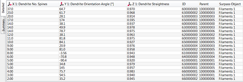
Simultaneously, in the Numerical table, all values of the selected parameters are listed. It is not always easy to see what information the numerical data is providing but by using a box plot you can more easily interpret large volumes of numerical data.
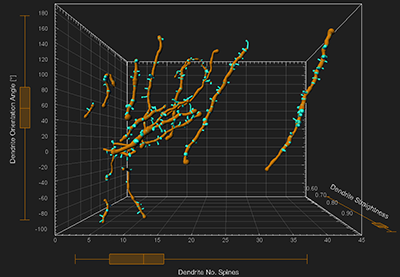
When the Show Box Plots option is selected, the ImarisVantage automatically orders all values of the selected variables from the smallest to the largest and determines the maximum and the minimum, the median and the important percentiles. Based on these calculations, the box plots are set up and displayed alongside the Vantage plot. The box plots can be drawn in all 3 dimensions.
How to interpret a box plot
A box plot splits the data set into quartiles. The central box contains 50% of the data. It represents the values from the 25th percentile Q1, to 75th percentile Q3. The median value is indicated by the line within the box plot.
The straight lines, called whiskers, extend from the ends of the box. The line extending from the first quartile to the minimum contains the smallest 25% of values and the line from the third quartile to the maximum contains the largest 25% of values.
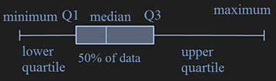
The spread of all the data on a box plot is visualised by the distance between the smallest and largest value. The smaller the box, the more consistent the data values are with the median of the data.
Data distribution and plot box
The length of the whiskers, the position of the median inside the box and the space between the different parts of the box provide information about the data distribution or skewness of a set of data.
A near symmetric data distribution is indicated by whiskers of equal length and a median positioned in the middle of the box.

When this is not the case and a plot box is not symmetrical, it can be concluded that the data distribution is not symmetrical. The data distribution is considered not symmetrical if within the data set there are either relatively high proportion of large or small values.
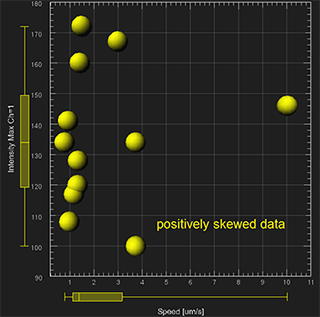
When the box is not centered between the whiskers, the data is either positively or negatively skewed. A positive skew is characterized by many small values and a few extremely large ones. In this case, the box is shifted significantly toward the low values and the whisker towards the higher values is longer.

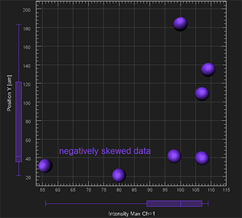
A negative skew, on the other hand, is characterized by many large values and only a few extremely small ones. In this case, the box is shifted significantly towards the high values and the whisker towards the lower values is longer.

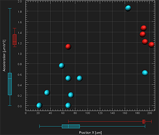
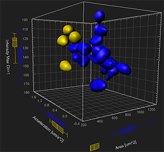
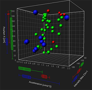
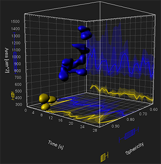
Multiple data sets
If the Vantage plot is composed of multiple objects (e.g. multiple experimental groups), a separate box for each object is created in the viewing area and a set of box plots are displayed side by side. For ease of comparison, the colour of the box plot corresponds to the colour of the Surpass object which is being used.
By comparing position, range, median, dispersion and skewness box plots allow a quick visual assessment of multiple data sets / objects / experimental groups. They can also help identify the difference in distribution and variability between several data sets.
Time and box plots
When using the “Time” plot type, the box plots represent a moving statistical summary. The box plot position and shape changes at each time point.
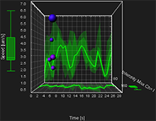
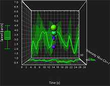
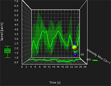
In addition, the 2D XY and XZ projection plots display the colored regions and lines . These represent the five-number summary of the selected variable over time. On these projection plots, a thick line indicates where the median value lies. The range between the Q1 and Q3 values is shown as the dark shaded region, while the minimum and the maximum range is the lighter shaded region.
You can easily compare how two or more variables change across time based on the line position and size of the shaded regions.
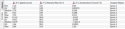
Summary table
In the Plot Numbers’ Area, the Summary table displays numerical data that is graphically shown using a box plot. The table displays the key percentiles of the selected variable: minimum, the lower quartile -Q1, the median, the upper quartile -Q3 and maximum.
Browse our related assets below...
© Oxford Instruments 2024
